Pointing to value
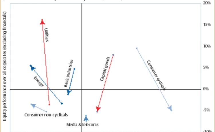
This chart shows how credit spreads have been performing versus share prices, and might help investors spot relative-value opportunities

The horizontal axis shows the excess spread over the ‘rock bottom’ spread relative to the average in the corporate bond market (excluding financials). The rock bottom spread is the minimum spread over Libor that
Only users who have a paid subscription or are part of a corporate subscription are able to print or copy content.
To access these options, along with all other subscription benefits, please contact info@risk.net or view our subscription options here: http://subscriptions.risk.net/subscribe
You are currently unable to print this content. Please contact info@risk.net to find out more.
You are currently unable to copy this content. Please contact info@risk.net to find out more.
Copyright Infopro Digital Limited. All rights reserved.
As outlined in our terms and conditions, https://www.infopro-digital.com/terms-and-conditions/subscriptions/ (point 2.4), printing is limited to a single copy.
If you would like to purchase additional rights please email info@risk.net
Copyright Infopro Digital Limited. All rights reserved.
You may share this content using our article tools. As outlined in our terms and conditions, https://www.infopro-digital.com/terms-and-conditions/subscriptions/ (clause 2.4), an Authorised User may only make one copy of the materials for their own personal use. You must also comply with the restrictions in clause 2.5.
If you would like to purchase additional rights please email info@risk.net
More on Structured products
A guide to home equity investments: the untapped real estate asset class
This report covers the investment opportunity in untapped home equity and the growth of HEIs, and outlines why the current macroeconomic environment presents a unique inflection point for credit-oriented investors to invest in HEIs
Podcast: Claudio Albanese on how bad models survive
Darwin’s theory of natural selection could help quants detect flawed models and strategies
Range accruals under spotlight as Taiwan prepares for FRTB
Taiwanese banks review viability of products offering options on long-dated rates
Structured products gain favour among Chinese enterprises
The Chinese government’s flagship national strategy for the advancement of regional connectivity – the Belt and Road Initiative – continues to encourage the outward expansion of Chinese state-owned enterprises (SOEs). Here, Guotai Junan International…
Structured notes – Transforming risk into opportunities
Global markets have experienced a period of extreme volatility in response to acute concerns over the economic impact of the Covid‑19 pandemic. Numerix explores what this means for traders, issuers, risk managers and investors as the structured products…
Structured products – Transforming risk into opportunities
The structured product market is one of the most dynamic and complex of all, offering a multitude of benefits to investors. But increased regulation, intense competition and heightened volatility have become the new normal in financial markets, creating…
Increased adoption and innovation are driving the structured products market
To help better understand the challenges and opportunities a range of firms face when operating in this business, the current trends and future of structured products, and how the digital evolution is impacting the market, Numerix’s Ilja Faerman, senior…
Structured products – The ART of risk transfer
Exploring the risk thrown up by autocallables has created a new family of structured products, offering diversification to investors while allowing their manufacturers room to extend their portfolios, writes Manvir Nijhar, co-head of equities and equity…


